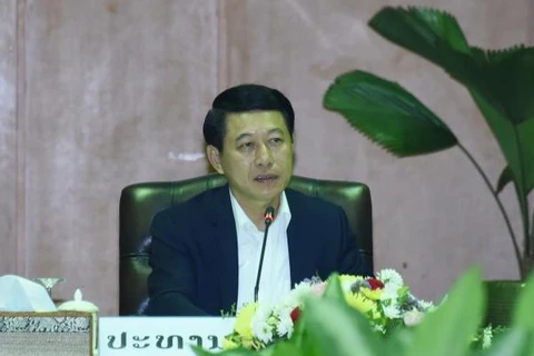
Laos announces the theme and logo of ASEAN Chairmanship 2024. (Photo: VNA)
 Both the theme “ASEAN: Enhancing Connectivity and Resilience” and the logo aim at reflecting the challenges and opportunities that the ASEAN region has faced over the past decades, reported local media.
In the face of challenges from economic and financial difficulties, climate change, natural disasters, cyber and traditional security issues, Laos realises the significance of increasing connectivity and resilience as a way to reinforce the ASEAN Community and effectively deal with current and emerging threats.
The logo has the four colours of the ASEAN flag and symbol - blue, white, red and yellow - designed in a circle, symbolising the globe and ASEAN's relationship with partners around the world. The circle is a combination of a C (the initial of Connectivity) and an R (standing for Resilience). The “ASEAN” text in the logo is presented in Lao script to represent the aesthetic design in the traditional culture of Laos.
As the ASEAN Chair 2024, Laos will use this logo in all ASEAN meetings at all levels. In addition, this logo will also be introduced in the mass media throughout the year to raise public awareness about ASEAN, starting from January 1, 2024.
This will be the third time for Laos to take the charge of the ASEAN Chair, which provides the country a chance to enhance its role and position in the regional and world arenas and promote its culture, tradition and tourism./.
VNA